Declutr
Declutr
A social bookmarking experience for people who likes to share knowledge.
A social bookmarking experience for people who likes to share knowledge.
Context
As a group of avid learners and information seekers, we have always been frustrated by the difficulty of finding and organizing relevant content online. We would often rely on scattered tools such as browser bookmarks, note-taking apps, and social media platforms to save and discover content, but these solutions were often inadequate and did not provide a seamless experience.
As a group of avid learners and information seekers, we have always been frustrated by the difficulty of finding and organizing relevant content online. We would often rely on scattered tools such as browser bookmarks, note-taking apps, and social media platforms to save and discover content, but these solutions were often inadequate and did not provide a seamless experience.
Goal
Create a web app that let’s you smoothly save, organize and share your favorite links with your personal insights.
Non-goal: To create a “read it later” app.
Create a web app that let’s you smoothly save, organize and share your favorite links with your personal insights.
Non-goal: To create a “read it later” app.
Outcome
We designed and shipped an MVP from scratch in just a few weeks, covering everything it takes to launch a real-world product. From user research to usability testing, we moved fast, made decisions with intent and delivered a thoughtful experience end-to-end.
We designed and shipped an MVP from scratch in just a few weeks, covering everything it takes to launch a real-world product. From user research to usability testing, we moved fast, made decisions with intent and delivered a thoughtful experience end-to-end.
My Role
Co-founder & Product Designer
Co-founder & Product Designer
Timeline
4 weeks
4 weeks
Worked With
1 Designer & 2 Engineers
1 Designer & 2 Engineers
Concept, designs
& launch MVP in 4 weeks
Concept, designs
& launch MVP in 4 weeks
I'm proud of this project because the aim was to build and ship something seamlessly functional. Here is how the work was broken down.
I'm proud of this project because the aim was to build and ship something seamlessly functional. Here is how the work was broken down.
Week 1 - Research & Initial Concepts
Bionic (designer) and I ran a quick survey to understand current experiences with a total of 12 responses. I sketched rough flows, these low-fidelity wireframes helped us align quickly on what mattered.
Bionic (designer) and I ran a quick survey to understand current experiences with a total of 12 responses. I sketched rough flows, these low-fidelity wireframes helped us align quickly on what mattered.
Week 2 - Design & Usability Test
We designed key flows including core screens and created a small UI library with reusable components. We then tested the prototype with potential users and uncovered friction in those flows.
We designed key flows including core screens and created a small UI library with reusable components. We then tested the prototype with potential users and uncovered friction in those flows.
Week 3 - Iterations & Code
Bionic and I iterated quickly, simplifying interactions and refining copy for better clarity. Engineers started working on code in parallel with our context driven handoffs in order to move fast.
Bionic and I iterated quickly, simplifying interactions and refining copy for better clarity. Engineers started working on code in parallel with our context driven handoffs in order to move fast.
Week 4 - Landing page & Launch
We polished the core experience, designed the landing page, and worked with engineers to ensure visual consistency for the launch.
We polished the core experience, designed the landing page, and worked with engineers to ensure visual consistency for the launch.
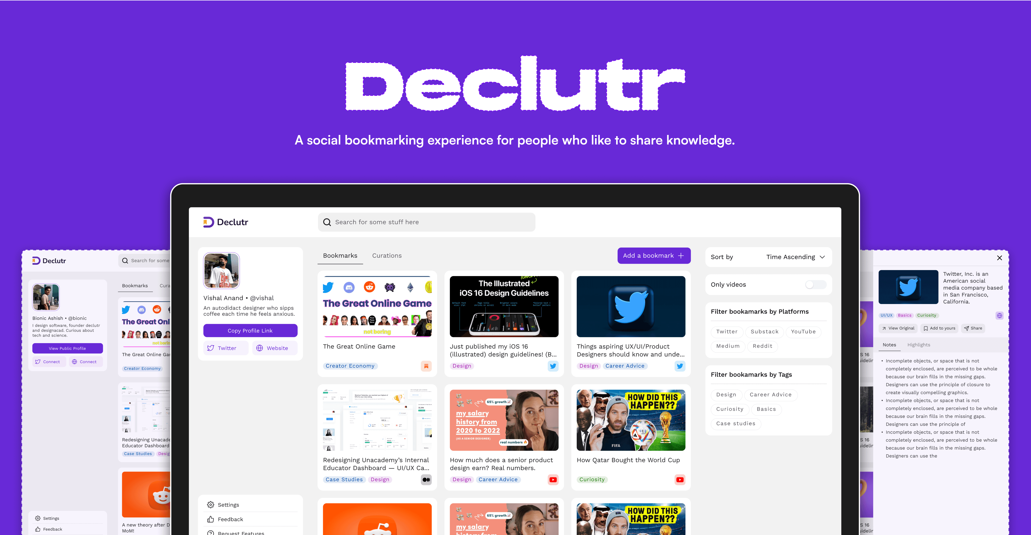
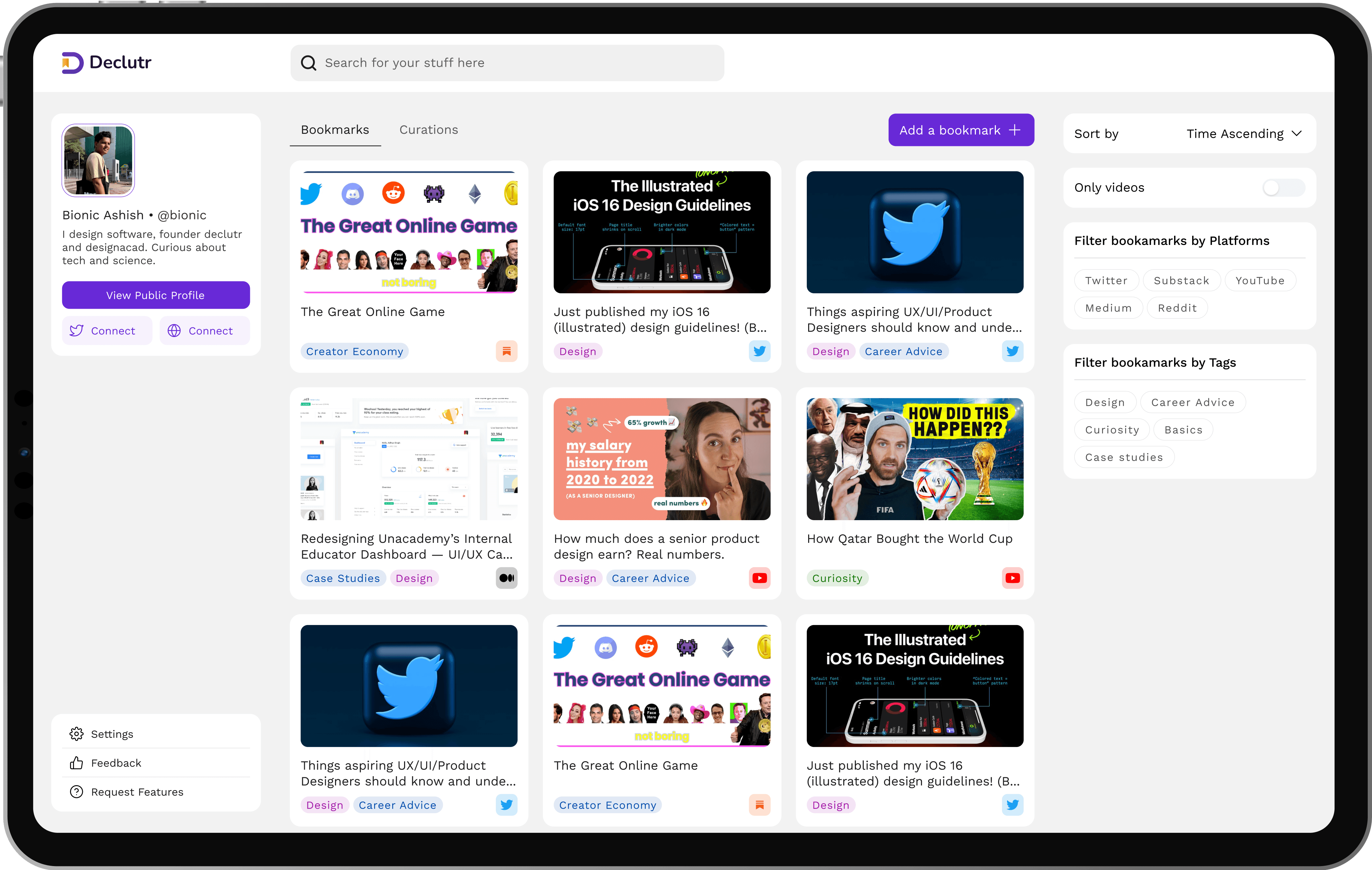
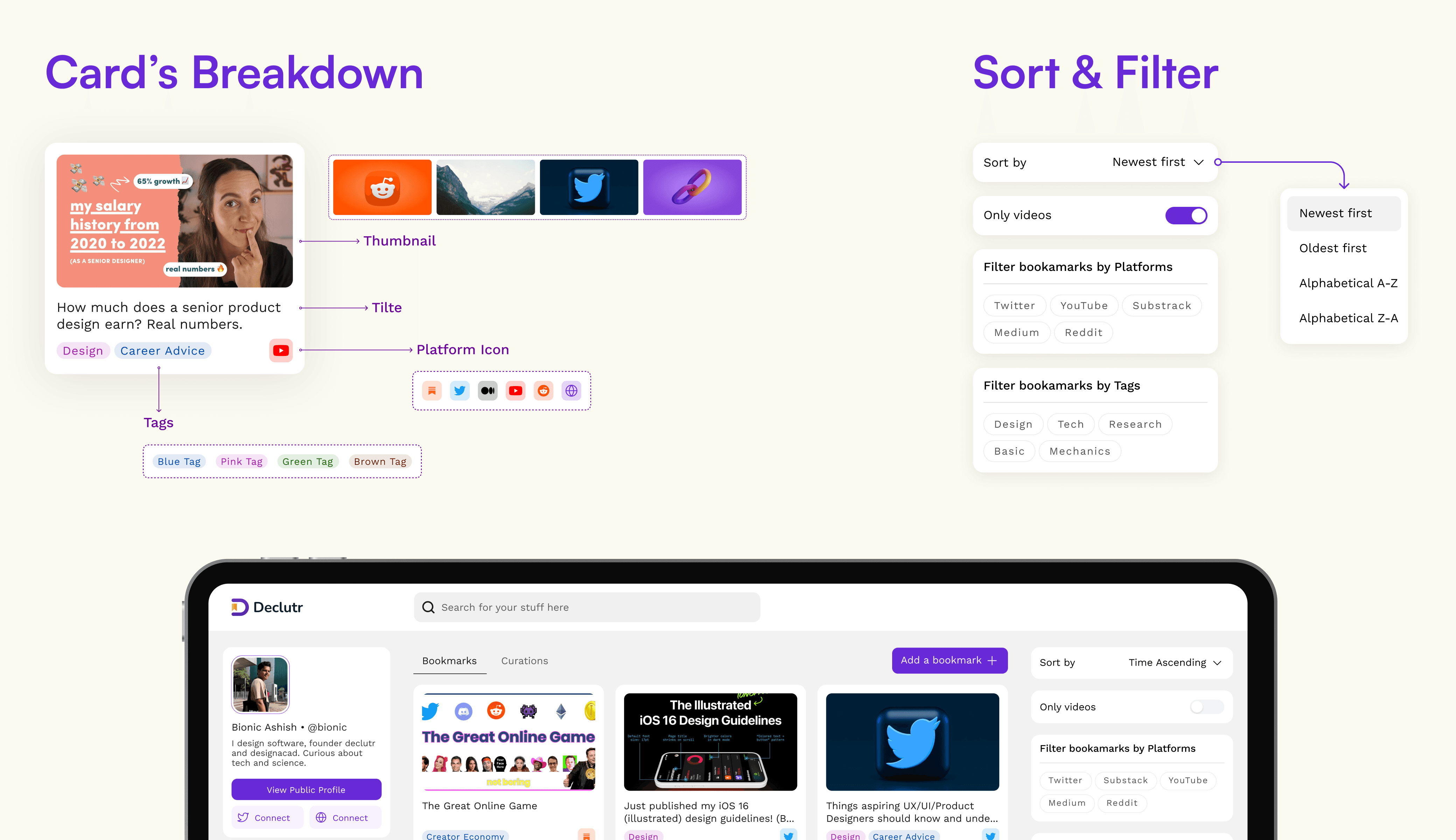
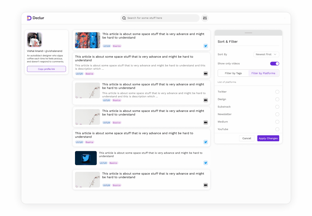
Core Screen #1
Dashboard
Dashboard
We had a checklist kind of thing in our mind for the key visual elements on the dashboard screen, Block like elements to communicate important information, minimal use of typeface’s weights & sizes and an appropriate amount of colors.
We had a checklist kind of thing in our mind for the key visual elements on the dashboard screen, Block like elements to communicate important information, minimal use of typeface’s weights & sizes and an appropriate amount of colors.
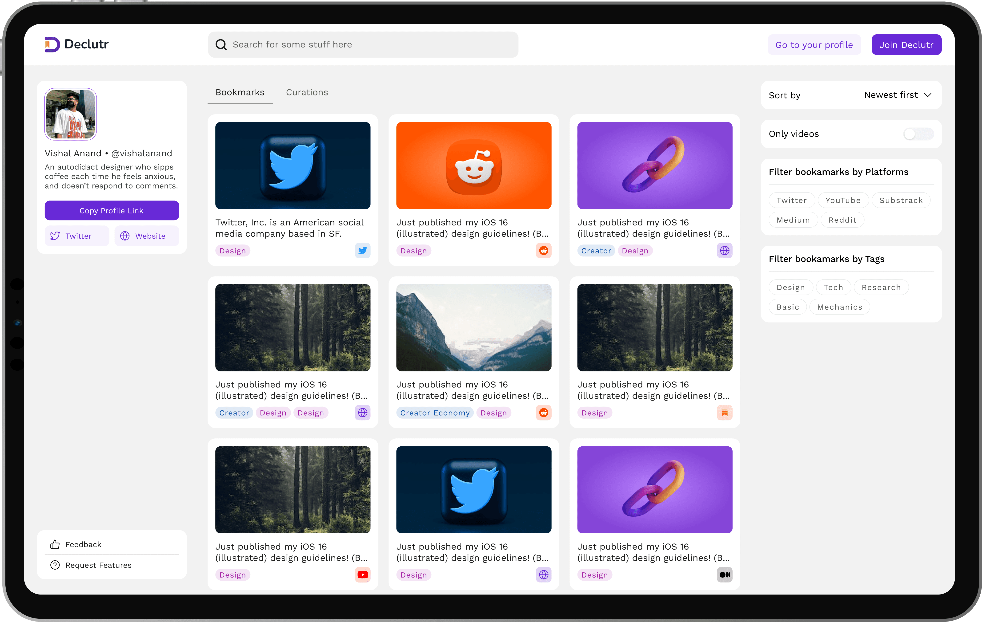
Core Screen #2
Public Profile
Public Profile
Public Profile was designed to solve the problem of collating and sharing all the useful links you want to share with the world. The ability to discover other users and explore their bookmarks is what set Declutr apart from other bookmarking platforms.
Public Profile was designed to solve the problem of collating and sharing all the useful links you want to share with the world. The ability to discover other users and explore their bookmarks is what set Declutr apart from other bookmarking platforms.
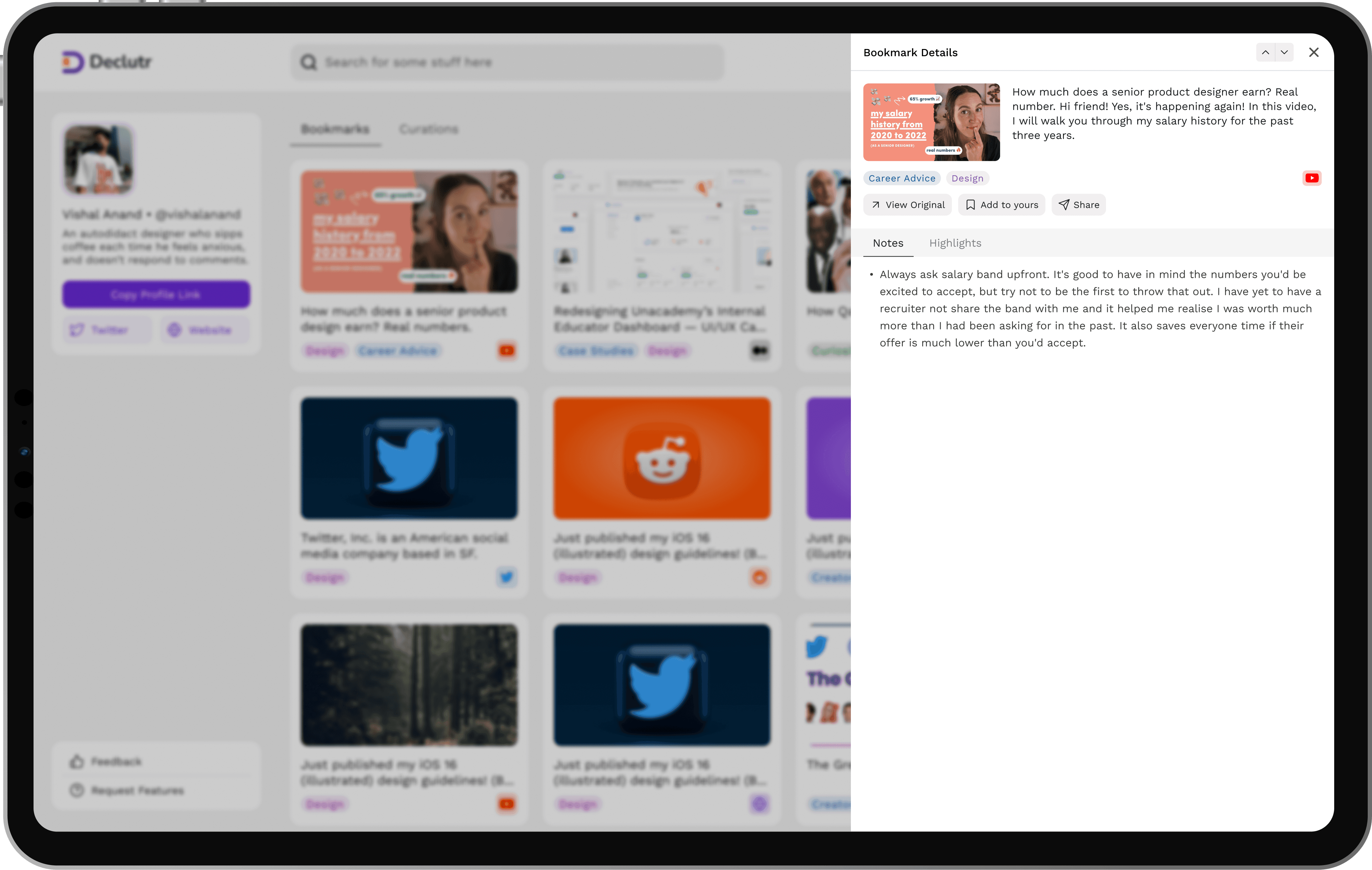
Core Screen #3
Side Panel
Side Panel
The side panel offered a deeper look into any bookmark, showing notes and highlights added by the user. It also lets you take quick actions like saving, sharing, or visiting the original source, enhancing the discovery.
The side panel offered a deeper look into any bookmark, showing notes and highlights added by the user. It also lets you take quick actions like saving, sharing, or visiting the original source, enhancing the discovery.
Usability testing
findings, iterations & BTS
Usability testing
findings, iterations & BTS
We learnt and did everything, from experimenting with wireframes, building our first components to working on typescale & color palette and refining flows. We collaborated closely, ran multiple UI iterations, and tested relentlessly to shape a product that’s both functional and delightful.
We learnt and did everything, from experimenting with wireframes, building our first components to working on typescale & color palette and refining flows. We collaborated closely, ran multiple UI iterations, and tested relentlessly to shape a product that’s both functional and delightful.
Launch & Numbers
Launch & Numbers
304
That's the total number of sign ups Declutr did.
That's the total number of sign ups Declutr did.
554
Bookmarks were added on the platform.
Bookmarks were added on the platform.
I am looking for my next role
I am looking for my next role
Let's Chat?
Let's Chat?